

Most scoop shops don't have a data problem. They have a disconnection problem. The POS knows what sold. The freezer logs know what melted. The schedule knows who was working. Payroll knows what it cost. But nobody has stitched those four things into a single view where one number explains another. So the owner ends up with a stack of reports that all technically "look fine" while the bank balance quietly disagrees.
The fix isn't more metrics. It's a layered structure — a KPI architecture for an ice cream shop that separates what you check hourly from what you check weekly from what you review once a season. When those layers are built right, a spike in waste on Tuesday automatically points you toward a labor mistake on Monday and a forecasting miss the week before. The numbers start talking to each other.
This post covers that system in full: three layers, the formulas that connect them, rough dashboard layouts, alert thresholds worth wiring up, and a reconciliation rhythm that fits a shop with two freezers and a summer rush — not a corporate finance department.
Why most scoop-shop dashboards quietly fail
The typical failure isn't laziness. It's that every metric gets treated as equally urgent, so nothing gets acted on.
The pattern shows up constantly: a shop tracks daily sales, waste, and labor cost — all three on the same screen, all three refreshed once a day. Sounds reasonable. But daily sales is something you can react to inside a shift, waste is something you diagnose across a week, and labor-to-sales ratio is a scheduling design problem you fix before the week even starts. Cramming them onto one flat report means the manager either checks everything obsessively or checks nothing and drifts.
The other silent failure is that raw numbers hide their own causes. "Waste was $180 today" tells you nothing. Was it a dropped tub? A freezer that thawed overnight? Over-portioning on a busy shift? A flavor that's dying and nobody pulled it? Without a layered structure, every number is an orphan — it doesn't know which parent metric it belongs to.
A good architecture assigns every KPI a layer, an owner, a check frequency, and a linked metric it explains or is explained by. That last part is what turns a dashboard into a diagnostic tool instead of a scoreboard.
The three layers, and what actually belongs in each
Think of it as altitude. Operational metrics are ground-level — you act on them mid-shift. Tactical metrics are the week-in, week-out steering wheel. Strategic metrics are the season-long map you only need occasionally, but which quietly determine whether the whole thing is worth running.
Keep your ice cream shop running smoothly.
Cremyly helps you manage every order, stock level, and staff shift with precision and ease.
- Real-time inventory tracking
- Order management dashboard
- Staff scheduling & shift coordination
No credit card required
| Layer | Time horizon | Who owns it | What it answers | Example metrics |
|---|---|---|---|---|
| Operational | Hourly / per shift | Shift lead | "Is today working?" | Scoops/hour, waste per shift, queue wait, temp-log compliance |
| Tactical | Daily / weekly | Store manager | "Is this week healthy?" | Labor-to-sales %, COGS %, waste %, forecast accuracy, average ticket |
| Strategic | Monthly / seasonal | Owner | "Is the business winning?" | Contribution margin by flavor, prime cost %, season-over-season revenue, customer repeat rate |
The mistake almost everyone makes is pushing strategic thinking down to the operational layer — obsessing over per-flavor margin during a Saturday rush when the shift lead can't do anything about it — or pushing operational noise up to the owner, who then panics about a single bad-waste day that reconciliation would've explained.
Each layer feeds the one above it. Operational metrics roll up into tactical ones. Tactical metrics aggregate into strategic ones. If your layers don't roll up cleanly, you've got a data taxonomy problem underneath, and it's worth fixing your tagging first — the way you structure POS categories and promotion codes decides whether these rollups are even possible. If your reports don't reconcile, start with a clean operational data taxonomy for POS tagging and dashboard rules before building anything on top.
The operational layer: what the shift lead watches
This layer is deliberately small. A shift lead running a Saturday line cannot monitor twelve metrics. Give them three or four that they can actually influence right now.
Scoops per labor hour. The single most useful operational number.
Scoops per labor hour = Total scoops served ÷ Total labor hours on shift
If your average dip runs around 3.8 oz and you know your daily scoop count from the POS, this tells you whether you're staffed to demand this shift. A shop that normally does 42 scoops per labor hour on a summer afternoon suddenly dropping to 26 means you're overstaffed for the current traffic — send someone home, or you're bleeding labor into a slow pocket.
Waste per shift (units, not just dollars). Track it as counts: dropped scoops, comped remakes, tubs pulled for quality. Dollars come later at the tactical layer.
Temp-log compliance. Binary. Either the logs got done on schedule or they didn't. A missed log is an operational alarm, not a strategic footnote — it's the leading indicator of the most expensive failure a scoop shop has, a freezer problem nobody caught until product was ruined.
Queue wait during peak. Rough is fine. "Line out the door for 20+ minutes" is a data point. It ties directly to lost sales and to whether your labor template matched the demand curve.
If a number can't change behavior in the next hour, it doesn't belong on this layer.
The operational-layer insight most owners miss: these metrics exist to trigger actions within the shift, not to be reviewed later. If a number can't change behavior in the next hour, it doesn't belong on this layer. Move it up.
The tactical layer: the weekly steering wheel
This is where the store manager lives, and where most of the real money is won or lost. Three formulas do the heavy lifting.
Labor-to-sales ratio.
Labor % = Total labor cost (wages + taxes) ÷ Net sales
For most scoop shops this wants to land somewhere in the high 20s to low 30s as a percentage. But the number alone is a trap — you have to read it against the demand forecast. A 34% labor week during a heat wave with record sales is fine. A 34% labor week during a slow, rainy stretch means your schedule ignored the forecast.
COGS % and waste %.
COGS % = Cost of goods sold ÷ Net sales
Waste % = Cost of wasted/dumped product ÷ Cost of goods sold
Splitting these matters. A rising COGS % could be ingredient price inflation (a buying problem) or portion drift (a training problem) or waste (a rotation problem). Keeping waste as its own ratio underneath COGS tells you which. If your per-scoop cost is drifting for reasons other than waste, the fix usually traces back to portioning discipline — worth revisiting how you calculate per-scoop cost and set menu prices so your COGS target is grounded in real portion math, not a guess.
Forecast accuracy.
Forecast accuracy = 1 − ( |Forecasted units − Actual units| ÷ Actual units )
This one gets skipped and shouldn't. If your forecast accuracy is sitting around 70%, your labor schedule and your ordering are both built on sand — and every downstream metric inherits that error. Tracking accuracy weekly is what lets you tighten the forecast, which tightens everything it feeds.
The tactical-layer pattern worth internalizing: no tactical metric is judged in isolation. Labor % is judged against forecast. COGS % is judged against waste and portioning. Waste % is judged against rotation and freezer events. This is the layer where the connections between sales, inventory, labor, and waste actually get made — and it's the same territory covered in the operations playbook for aligning inventory, scheduling and daily P&L, which pairs well with this framework.
The strategic layer: what the owner reviews, and rarely
At the top, you're looking at the numbers that decide whether flavors, locations, and the whole season are worth running. You do not check these daily. Checking prime cost every morning just produces anxiety.
Prime cost.
Prime cost % = (COGS + total labor) ÷ Net sales
This is the one number that summarizes operational health in a single figure. Most healthy scoop shops want prime cost in the low-to-mid 50s as a percentage. If it drifts into the 60s and stays there, no amount of daily tweaking fixes it — something structural is wrong with pricing, menu mix, or staffing templates.
Contribution margin by flavor.
Contribution margin = Selling price per scoop − variable cost per scoop
Ranked across your menu, this tells you which flavors earn their freezer space and which are vanity SKUs eating cold storage and rotation labor. A flavor doing decent volume at a thin margin can quietly lose to a lower-volume flavor with a much better margin.
Season-over-season revenue and repeat rate. Directional metrics. Are you growing against the same period last year? Are customers coming back? These frame every decision below them but require no daily attention.
The strategic insight here: this layer changes slowly, which is exactly why owners should resist touching it often. Its job is to catch drift, not noise. If your tactical layer is healthy week after week, the strategic layer mostly takes care of itself. When strategic numbers go bad despite solid tactical numbers, that's your signal that your targets are wrong — you're hitting your labor and COGS goals, but the goals themselves don't add up to a profitable business.
Dashboard wireframes (text-based, because layout is the point)
You don't need pretty charts. You need the right thing in the right place.
Operational screen (shift lead's tablet, glanceable):
[ SCOOPS/LABOR HR: 38 ▲ ] [ WASTE THIS SHIFT: 4 units ] [ TEMP LOG: ✓ on time ] [ QUEUE: normal ]
Big, few, color-coded. If it needs interpretation, it's on the wrong screen.
Tactical screen (manager's weekly view):
WEEK-TO-DATE Labor %: 31.2% (target ≤ 30%) ▲ over COGS %: 28.4% (target ≤ 27%) ▲ over └ Waste %: 3.1% (target ≤ 2.5%) ▲ over Forecast acc: 82% (target ≥ 85%) ▼ under Avg ticket: $9.40 FLAGGED: Waste + COGS both over → check rotation & portions
Notice the indentation — waste sits under COGS visually, so the cause-and-effect relationship is baked into the layout. The flagged line at the bottom does the connecting for you.
Strategic screen (owner's monthly review):
Prime cost: 54.8% (season target ≤ 55%) Revenue vs LY: +6% Repeat rate: ~41% Bottom 3 flavors by margin: [Mint, Rum Raisin, Coffee]
Sparse on purpose. Four things. If the owner is scrolling, the strategic dashboard is doing too much.
Alert rules that are worth wiring up
Alerts should be rare, specific, and tied to an owner and an action. An alert that fires every day gets ignored by week two. Here's a working checklist of thresholds worth setting:
-
Labor % exceeds target by 3+ points on a non-forecasted-busy day → manager reviews the schedule template before next week.
-
Waste % over 4% for two consecutive days → shift lead runs a rotation check and logs root cause (drop, thaw, over-portion, dying flavor).
-
Temp log missed → immediate alert to manager, not a next-day report. This is the one alert that should interrupt someone.
-
Forecast accuracy under 75% for the week → owner and manager review what the forecast missed (weather, event, promo).
-
Scoops-per-labor-hour drops 30%+ below the shift's rolling average → shift lead adjusts staffing in-shift.
-
A flagged flavor's contribution margin turns negative → strategic review; candidate for retirement or reprice.
The rule behind the rules: every alert names who acts and what they do. An alert with no owner is just noise with a color.
The reconciliation cadence that ties it together
Layers and formulas are useless if the underlying numbers don't reconcile. A shop can have a beautiful dashboard built on POS data that quietly disagrees with the freezer count and the bank deposit. Reconciliation is the boring habit that keeps the whole architecture honest.
-
Daily (5 minutes, close of business) POS sales total vs cash + card deposits. Waste log tallied against the physical count of pulled product. This catches theft, comps that weren't rung, and miscounts while they're still small.
-
Weekly (20–30 minutes) Recompute labor %, COGS %, and waste % from actuals, not estimates. Compare forecast to actual and log the accuracy figure. Spot-count three or four high-value tubs against what inventory says should be there.
-
Monthly (about an hour) Full inventory count. Recalculate prime cost. Re-rank flavors by contribution margin. This is where you catch slow leaks that daily checks miss — the freezer that's been running warm for three weeks, the flavor that's been dying since the last count.
-
Seasonal (half a day) Reconcile the strategic layer against reality. Did your targets actually produce the margin you needed? Reset targets for next season based on what the numbers taught you.
Visualize the cadence as a simple workflow:
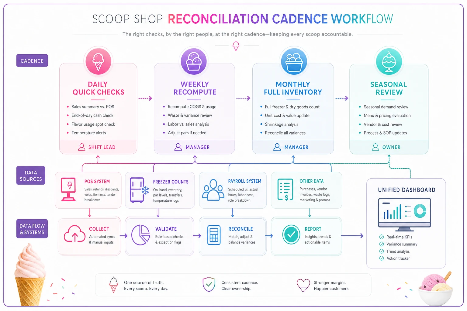
The reconciliation insight most shops learn the hard way: daily reconciliation is what makes weekly and monthly numbers trustworthy. Skip the 5-minute daily check and by month-end you're doing forensic accounting to figure out where $600 went, with no hope of pinning it down.
A real scenario: where the layers earned their keep
A two-freezer neighborhood scoop shop, doing roughly $18k–$22k a month in peak season, kept posting "fine" daily reports while the owner watched the monthly bank balance shrink. Every daily number looked acceptable in isolation.
When they laid the metrics into three layers, the problem surfaced fast. Their tactical view showed COGS creeping around 30–31% against a 27% target, and — crucially — waste sitting under it at roughly 4.5%. The operational layer showed temp logs getting skipped on closing shifts a couple nights a week. The connection was obvious once the layers made it visible: a freezer was running slightly warm overnight, softening product that got dumped the next morning, and the missed closing logs meant nobody caught it.
Fixing the freezer and enforcing the closing temp-log alert pulled waste back toward 2%, which pulled COGS back under 28%. On their volume, that recovered somewhere in the neighborhood of $300–$450 a month that had simply been getting thrown away. Nothing exotic — just a structure that let a warm freezer, a skipped log, and a COGS drift finally show up as one connected problem instead of three unrelated numbers that each looked fine on their own.
When this full architecture makes sense — and when it doesn't
When it's worth building: You're running at least one busy season with a manager or shift leads, you've got a POS that exports clean data, and your monthly numbers already feel disconnected from your daily reports. If you're guessing where margin goes, you're ready for layers.
When it's overkill: A brand-new single-window stand doing modest volume with the owner working every shift doesn't need three dashboards. At that scale, the owner is the reconciliation system. A single weekly P&L check and a daily cash-vs-POS tie-out covers it.
Who should skip the strategic layer for now: If your tactical numbers are a mess — labor and COGS swinging wildly week to week — don't waste time on contribution-margin rankings and season-over-season analysis yet. Fix the tactical layer first. Strategic metrics built on unstable tactical data just produce confident, wrong conclusions.
The bigger point
A scoop shop isn't a set of separate departments — sales, inventory, labor, waste. It's one system where every number is the cause or the effect of another. A warm freezer becomes waste becomes COGS becomes prime cost. An ignored forecast becomes bad staffing becomes labor % becomes a shrinking margin. The whole reason to build a layered KPI architecture is to make those chains visible so you can act at the right altitude — in the shift, in the week, or across the season — instead of drowning in forty numbers that never explain each other.
Start with clean tagging so your metrics roll up honestly. Build the tactical layer next, because that's where the money moves. Add reconciliation so the numbers stay trustworthy. Then, and only then, let the strategic layer tell you whether the whole thing is worth what you're putting into it.
A scoop shop isn't a set of separate departments — sales, inventory, labor, waste. It's one system where every number is the cause or the effect of another. A warm freezer becomes waste becomes COGS becomes prime cost. An ignored forecast becomes bad staffing becomes labor % becomes a shrinking margin. The whole reason to build a layered KPI architecture is to make those chains visible so you can act at the right altitude — in the shift, in the week, or across the season — instead of drowning in forty numbers that never explain each other.
Start with clean tagging so your metrics roll up honestly. Build the tactical layer next, because that's where the money moves. Add reconciliation so the numbers stay trustworthy. Then, and only then, let the strategic layer tell you whether the whole thing is worth what you're putting into it.
Ready to scoop up efficiency and grow your shop?
Join hundreds of ice cream shops using Cremyly to boost productivity, reduce waste, and delight customers with faster service.